We built the QR Payminder dashboard around one idea: within three seconds of signing in, you're looking at the QR code of the payment it makes most sense to pay right now. No charts, no digging through menus — you point your phone and pay.
What you'll find on the dashboard
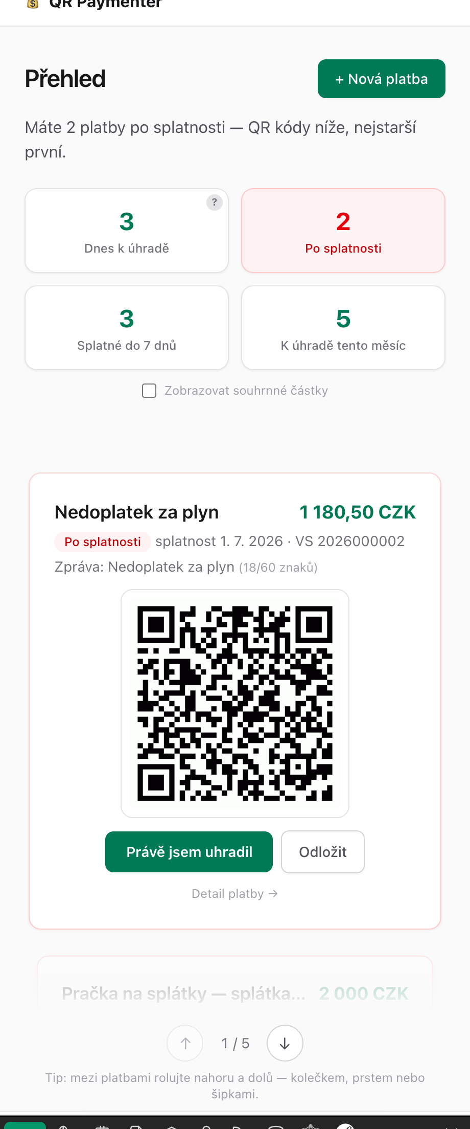
The context sentence at the top says what matters right now: "You have 2 payments overdue", "Rent is due today", or — ideally — "Nothing to pay as of today."
Filters show payment counts in windows that make sense: Due today (including tomorrow — a transfer through a bank without instant payments takes a day), Overdue (in red, so you can't miss it), Due within 7 days and Due this month. The filters are dynamic — whatever is at zero, you don't see. When you have no overdue payments, no red card haunts you. Clicking a filter switches what the QR code queue below shows.
Summary amounts under the counts stay off until you turn them on. Some people find it helpful to see "18,681 CZK by the end of the month"; for others it feels crushing — in the spirit of atomic habits we focus on what to do now, not on the size of the pile. The choice is yours.
The QR code queue is the heart of the dashboard: the most urgent payment in the middle, the next ones peeking above and below. You scroll with the wheel, a finger or the arrow keys. Each card has "I just paid" (the card grays out so your phone doesn't scan it twice by mistake) and "Snooze" for things you'll deal with later.
Why it isn't a classic dashboard
Classic dashboards show state — charts, balances, history. We show action. We take our cue from how to-do lists work: the most important thing first, one thing in focus, the rest out of the way. The state is in the payment list whenever you want it.